Brilliant Brusho!
Brusho is a watercolour pigment which is supplied in small drums of crystalline powder. The powder is very vivid and a little goes a long way – often beyond your project and half way across your desk!! The powder can be mixed with water to use as a traditional watercolour medium or can be used with sprayers and brushes to create a unique mix of hues and patterns. This second use interested me for making backgrounds for my cards.
Warning! It’s quite a messy business. Cover your desk with some scrap paper and if you don’t want multi-coloured fingers for a few hours, wear gloves.
I had chosen mainly blues with a purple and black as I wanted to create night sky inspired works. The pots arrived and were identical in their anonymity! The colour names were written on the pots but I thought it would make life easier if the actual colours were displayed on the pots. I mixed up a tiny amount of each powder with a little cold water and painted a patch of each colour onto some sticky labels. When dry, I cut out a circle (my 1” punch is the perfect size for the pot lid) and a couple of small strips for the sides of the pot. I pushed a pin into each lid to make the pots into shakers to save taking the lids off each time.
I also cut out a smaller circle for my index card and also had a little calligraphy fun with this too.
Using shimmer paper (as I would be using a lot of water, watercolour paper would also work), I taped the pieces to a board to keep them flat. It was more successful than not taping - the pieces still buckled but not as much. For these four pieces, I either spritzed - powdered – spritzed or just powdered -spritzed. Here you can see
1. the powder on dry paper;
2. the crystals starting to burst when the water is applied;
3. the patterns changing as more water is added making more colour release. I used a mix of 3 or 4 colours on each piece.
When I was happy with the coverage and patterns, I left them overnight to dry. I’ll warn you – it’ll probably look a right mess at this stage. The colours are lighter when they're dry so wait until then before you decide whether to chuck it away!! You may be surprised…
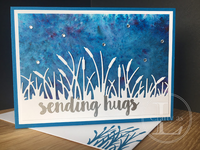
Remember the Friendly Silhouette dies from a few weeks ago? I wanted to use these again but using white rather than black card and the dramatic backgrounds created using Brusho are perfect for this.
What’s lovely about Shimmer White card is that it has a light glittery effect which shines through the Brusho and adds a bit of interest to the sky.
I tried a sentiment in a smaller font on this card but it looked a bit lost so instead I decided to make the most of the dark background and heat emboss the sentiment there instead.
This panel looked more like a galaxy so I added the star flourish and the star cut outs from Stitched Stars dies (to be released in the 2019 Autumn/Winter Catalogue on 4th Sept). The coordinating So Many Stars stamp set has only Christmas sentiments so I used another star-themed one from my stash.
I had chosen these colours for making snowy night skies for Christmas cards and these two were made using only Prussian Blue. The top one was sprayed first then had crystals sprinkled on. The bottom one had crystals sprinkled onto dry paper and then brushed with a paintbrush and lots of clean water. A little mist of spray created the blue haze at the bottom. I heat embossed the trees from Waterfront and Snowfront (another A/W 2019 catalogue release) stamp sets and stars from So Many Stars using white embossing powder.
This card also featured only Prussian Blue. This time, I painted plenty of clean water where I wanted my sky and left the bottom white for the snow. I then sprikled the pigment onto the wet area. As the card bent with the added water, it allowed the paint to run and create that brilliant Northern Lights type of pattern. Bet I can't recreate that!
As the paper got quite warped, I used wet glue to adhere the panel to the card base and placed it under a weight until dry. It emerged perfectly flat.
Here’s another galaxy style with a large cut out star with the new Mercury Acetate (A/W Catalogue) behind and some silver heat embossing.
Stampin’ Up! Have now released Pigment Sprinkles, their own version of Brusho in colours to match some of their card and inks. The colours are mainly pinks, oranges and greens so will give a completely different look. I think I’ll be purchasing some of those in the not too distant future!
p.s. You remember at the beginning how I said the crystals go a long way? This is what I cleaned off my desk afterwards despite having protective sheets of paper down...


Comments
Post a Comment