Posts

Showing posts with the label cocktails

Cheers for Cocktails
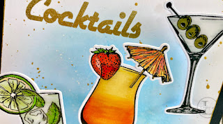
Image
You may recall that I mentioned that I retired a few weeks ago and my card this week is the one I sent my workmates to thank them for their generous gifts. For the decorative elements, I used Visible Image’s Cocktails & Dreams stamps and dies, together with the ‘CHEERS’ from Bring On The Beers.   The cocktails were stamped and clear heat embossed. I like to clear heat emboss as it gives me options of how to colour the images and I chose alcohol markers.   My collection of markers is a mixed bunch, consisting of Copic, Spectrum Noir, Prism and Nuvo and I just mix and match.   After colouring, I die-cut using the coordinating dies, although I had to do the martini with partial die-cutting as I’d stamped the olives in the glass. For some glassy effect on the cocktail glasses, after adhering the decorations, I covered the whole glass with Glossy Accents and set aside to dry. Whilst the glasses were drying, I made the background panel by lightly blending Salty...
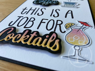
Coffee or Cocktails?

Image
Mr L gave me the idea for this week’s card where sometimes, a coffee just won't cut it! In the Nothing’s Better Than stamp set, there are lots of fun little phrases to pair with the main words but none that quite say this.  I first tried doing small lettering like the stamps but the big, bold lettering worked better for the feel of the card. I used the Love You More Than dies and wanted my focal words to stand out on a background.  For the words, I blended Misty Moonlight/Smoky Slate and So Saffron/Rococo Rose onto two pieces of white card. For the black backgrounds, I drew around the outside of the die and fussy cut. The black halo really helps the words have drama! Next, using my grid paper, I experimented with wording layouts and styles, eventually choosing a plain, bold style.  I transferred this onto vellum before transferring onto the card using my light box. To finish, I stamped the coffee cup and cocktail glass, colouring with the same inks and die cutting,...

Posh Graffiti

Image
  This week, a parcel from Stampin’ Up! was delivered so I got to play with some goodies from the new catalogue.  I really liked the look of the 'Nothing’s Better Than' stamp set and thought it would make a great card designed to look like a graffitied wall, albeit quite posh graffiti! First, I stamped my image and writing in black ink. Next, I used the block coffee cup to add some colour to the image.  I didn’t want a plain colour so applied Pool Party and Pretty Peacock using sponge daubers to give an ombre look. To get card looking like a wall, I ran the piece through my Big Shot in a brickwork embossing folder. The final stage was to mount the front onto a black layer and then a Bermuda Bay card base.  I stamped the coffee cup on the liner and envelope to finish. For my second card, I used a cocktails theme, and did the same ombre inking for the drink, using So Saffron and Poppy Parade. Lovely, quick cards but fun and stylish too!