Posts

Showing posts with the label painting

Multi-Coloured Mayhem
Image
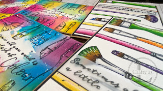
  My Colorado Craft Company Color My World stamp set was still out on my desk from the post a couple of weeks ago so I thought I’d have another play with it.   First, I decided to actually paint the brushes so I stamped onto hot-press watercolour paper and got busy with my watercolours.   To finish the cards, I heat-embossed the sentiment on vellum and wrapped it around the panel, affixed the panel to black card and then onto a kraft card blank. For the next cards, I was inspired by a tag that I made for a Facebook group challenge, the theme of which was “something you want to do more of in 2024” and mine was painting. Again, using hot-press watercolour paper, I stamped the brushes and the sentiment, although I found another stamp with the English spelling of ‘colour’ and used that instead. Next, rather than painting, I used ink-smooshing to add some colour to each panel.   On my craft mat, I smooshed several Distress Inks and sprayed water over.   I chose Distress Inks rathe
One For The Books

Image
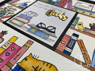
This card was a commission from a friend for a card for his wife.  The brief was “she likes books”.  I don’t have any stamp sets or dies featuring books and, whilst there are some available, the cost was rather high just to make one card.  My drawing skills are minimal but I figured I could draw a few books since they’re basically just rectangles so I set about sketching a doodle-style bookcase, adding a few stamps that were the appropriate size. After this sketch was approved by my friend, I started on the proper version.  I wanted to watercolour the images so drew out the shelves on watercolour paper and stamped the various images in place using Versafine Clair ink, which is waterproof. Using a waterproof fineliner, I then drew in the books. Once the drawing was complete, I pulled out my paints and spent a pleasant half hour adding some colour to the images. For the central focal panel, I had planned to use the Cricut to cut out some book shapes howe

Metallic Accents

Image
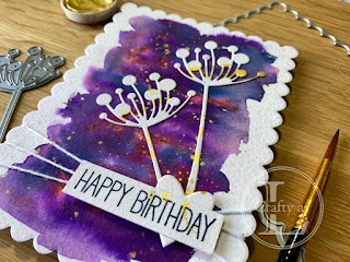
This week’s post features an outing for a rarely used die that I bought when I first started card making many years ago.  It’s a silhouette flower/foliage that I really like the shape of but have never really used very much. As I was planning on white silhouette images, I needed a vibrant background so I dug out my Brushos.  I mixed up some Prussian Blue and Purple and, after putting on some clean water onto my watercolour paper, dropped in the colours and let them mingle and do their thing.  To add some sparkle to the background, I spattered on some gold Finetec paint.  On another piece of watercolour paper, I swirled some of the gold paint to use for the die cuts. Once the paint was dry, I die cut the panel with a scalloped frame and cut out the flower heads. The flowers were glued onto the background and a little white twine was wrapped around the panel.  From the leftover gold-spattered card, I die cut a small heart to cover the base of the flowers and a rectan

Christmas Watercolour

Image
This week, I’ve been slightly obsessed with watching beginner watercolour videos on YouTube.  I’ve watched loads of videos - they’ve kept me entertained (distracted?) whilst I’ve been on the treadmill!  The artists all make watercolour painting look so easy.  I’ve never painted but have fancied trying out watercolour for a while, so thought following some guidance would be a good place to start. First was a scene with a colour washed background with fir trees in the foreground from Maremi SmallArt. I colour washed and dried the background before painting in the trees in varying shades of grey/black.  This gives depth to the scene by making it look like the lighter trees are further away and darker ones in the foreground.  Once the pictures were dry, I splattered on some white acrylic paint for snow.  I was very happy with how these turned out. After completing these two, I went downstairs to show Mr L and found that he had been busy creating himself.  He’d fashione

The Great British Music Room!

Image
  You may have seen our jazzy music room wall behind our parents in the Christmas Carol Evening blog post. When it came to decorating our music room, so called because it houses all our musical instruments including Mr. L's kazoo (!), we decided on a red, white and blue theme. Now nothing is more red, white and blue themed than the Union Jack or Union Flag (I’m never sure what we’re supposed to call it) so that seemed a good starting point. I thought the whole flag would be too much so decided on just a quarter of what would have been a HUGE flag.  It’s quite tricky to draw the Union Jack and have it look right so Google came to my aid and I found out what the ratios should be. The cross of St. George is red and is one fifth the flag’s height.  The white border is one fifteenth of the height. The saltires of St. Andrew and St. Patrick are intertwined, with the St. Andrew cross being one fifth the flag’s height.  This is then divided into 6 and then two of the six bits are allocat