Ice, Ice Baby

I was first introduced to the Black Ice technique at Team Training back in January this year. One of the other demos, Stella, did a demonstration of this and I thought it looked quite intriguing. I made a note of it, thinking I’d try it out soon and then promptly forgot all about it!
Sadly, Stella passed away earlier this month but thinking of her reminded me that I hadn’t given the technique a go. I didn’t know Stella well but first met her a few years ago at a card making class and subsequently met her a few times at demonstrator events. She was always very friendly, so full of life and had a great sense of humour. She will be missed and I dedicate this post to her.
The technique was ‘invented’ by an American demonstrator called Melissa Kerman. She has lots of great videos on YouTube, not only on this technique but lots of other cool ideas too. Anyhow, here’s my first crafting journey onto Black Ice!
First of all, shiny card is needed for this technique: foil sheets are perfect. I used silver foil and Grapefruit Grove foil (from Sale-A-Bration earlier this year). I hadn’t used any of this foil as I had no idea what to do with I, it’s not really one of my colours. It seems it was crying out for this technique.

A sheet of scrap paper is needed to work on. I applied a small amount of temporary adhesive to the back of the foil piece and stuck it to the scrap paper. It is possible to do this without sticking the pieces down but it does make life easier. Using a black Stazon ink pad, I started off the edge of the card and lightly dragged the ink pad down the foil, pressing harder at the beginning and end to get a black edge. The aim is to get a streaked, antiqued kind of look. It took a couple of passes as the card was wider than the ink pad.

Next, again using black Stazon, I stamped my design. I used a selection of sets; Best Catch, Beautiful You and Lilypad Lake. My fisherman looked a bit lost, floating in mid-air so I masked him and stamped the water from Lilypad Lake, after wiping off some ink as the fisherman image is quite fine.

Once the ink was completely dry (if in doubt wait a bit longer or dry with a heat tool) it was time for stage 2. This time, I took a Versamark pad and using just the weight of the pad, dragged it down the foil piece in the same direction as the Stazon. Again, it took a couple of passes. I then applied clear embossing powder and heat set it.

The aim is to get a streaky look with the embossing powder, looking like lines of ice crystals, hence the name! Here’s a close up once mine had been heat embossed.

I messed up the edge of this one as my temporary adhesive was rather more temporary than intended and came loose as I was applying the Stazon! This resulted in the two heavy lines of ink on the left, which isn’t a good look. I used an Inkylicious Picture Perfect stamp that I’ve had for years which has its own frame so at least the foil piece wasn’t wasted.

So, here are my finished cards. I didn’t do much with the backgrounds as I wanted the focal image to be the star of the show. (My photograpic prop this week is a kestrel feather. We are lucky enough to have kestrels nesting just down the lane each year and I found this feather on our driveway.)
Best Catch fisherman with the other fishing images stamped for the background and sentiment from the same set. I used Basic Black and Always Artichoke as I love khaki and have stacks of that card. It is retired now but Mossy Meadow is almost the same.

The yachts and water from Lilypad Lake with Pacific Point background embossed with retired Seaside embossing folder (there’s a High Seas folder now that would work for this theme).

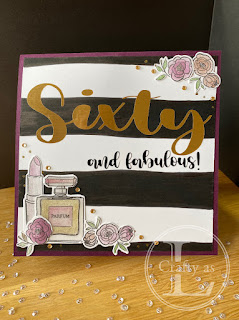
The next two are my Beautiful You cards. As I wrote earlier, Grapefruit Grove is not my kind of colour scheme so I didn’t have any coordinating card stock for my card base. I found that the copper embossing powder worked well with the iced panel and Blackberry Bliss and Rich Razzleberry offered a good supporting role together with the Scripty embossing folder. The other card used some very old DSP that had a vaguely pinky-peach coloured design on it.

Lastly, here’s the ‘rescued’ panel. I used a strip from an iced panel that I completely messed up in place of ribbon under the sentiment.

I hope you’ll give this technique a go. It does involve a little trial and error but is great fun and gives stunning results.


Comments
Post a Comment